Filter widget
Using the Filter widget, you can configure a search option using the given values.
Use cases:
You want to have a list of devices returned that match specific criteria. Filters of the Device filters type can be configured.
You want to search for any value within the view. The Text filter with a free text search option can be configured.
You know that some of your users are not that experienced. The Selection filter offering suggestions can be configured.
You want to search for specific devices. A Device filter of the General filters type can be configured.
You want to share your filter with other users of the same project. The different sharing options can be used.
You want to easily search and find values in relation to each other using various filter options and see the number of matching results. The faceted search option can be enabled.
This is only a basic filter definition. A filter must be connected to parameters from a query template(s) to collect the data. The technical name of the filter must be the same as the technical name of a parameter from the query template.
Only one filter widget can be created per dashboard.
Global filters are actually Device filters or General filters marked as global filters. When a filter is marked as global, it can be defined and shared across multiple dashboards. This allows you to view data in the same context for individual or multiple devices. When an element is selected in a global filter of one dashboard, the information related to that filter can be also seen in a different dashboard. The fact that a filter is defined as a global filter is indicated by the dark blue background of its chip and the globe icon, as you can see in the example screenshot below.
Device filters allow you to configure a filter on the properties that have been defined for the available device type(s). A device filter can be used as a data source of multiple widgets, with the data source option of Devices from Filter Selection.
General filters are quite versatile. The following general filter options are available:
Text
Provides a text field for arbitrary textNumber
Provides fields for adding minimum and maximum valuesDate Time Range
Provides a date/date time pickerCheckbox
Provides a checkboxSelection
Provides a drop-down list of configurable itemsDevice
Provides a drop-down list of devicesQuery Condition
Provides conditions to filter the data
Example

Proceed as follows
Select Filter Widget in the widget list.
→ The widget configuration page is displayed.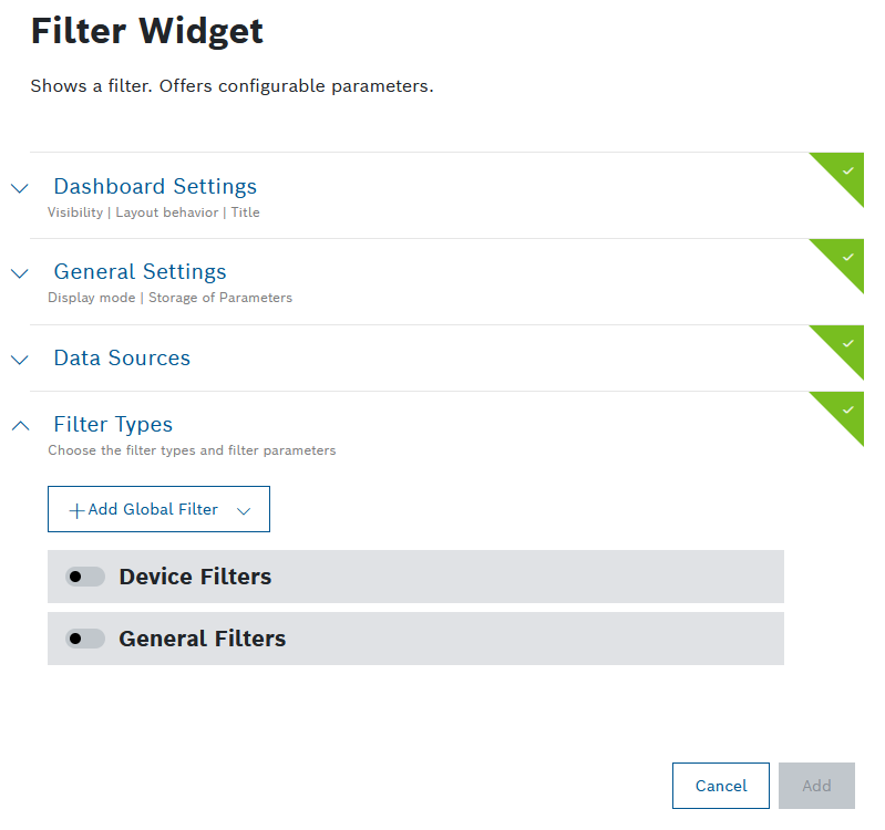
Configure the settings as described below.
Click the Add button.
→ The widget is added to the dashboard.
Dashboard Settings
Open the Dashboard Settings pane to set how the widget is displayed in the dashboard.
In the Size drop-down list, decide how much space the widget should take in the form of columns.
In the Visibility drop-down, set whether the widget should be visible or hidden. You can also define for which specific roles the widget will be shown or not. This setting allows you to customize dashboards for specific user groups that have a certain role.
Visible: The widget is visible for all (default)
Visible for roles: The widget is visible if any of the selected roles matches one of the user's project role
Hidden: The widget is hidden for all
Hidden for roles: The widget is hidden if any of the selected roles matches one of the user's project roleThe filter widget can be easily edited on the dashboard through the Edit Filters option in the dashboard actions menu. This is especially convenient when the widget is Hidden or Hidden for roles. Refer to Editing a widget.
In the Layout behavior drop-down list, decide how the size of the widget should be adapted in the dashboard.
In the Title field, enter a title for the widget.
For a dynamic title, you can add placeholders with the ${...} notation. The placeholder source is filterParams (if a filter widget exists on the dashboard, e.g. ${filterParams.paramName}).
The title will not be displayed if the widget is Sticky, as described in Display mode in the General Settings below.
General Settings
Open the General Settings pane to configure some general aspects of the widget.
In the Display mode drop-down list, define how the widget will behave on the dashboard:
Sticky (default): the filter widget will be attached to the top of the dashboard and will always stay there even when you scroll
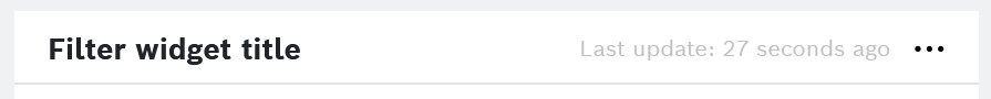
The Sticky display mode will hide the widget's Title, as well as the Last update property.
Draggable: the filter widget will be displayed on the dashboard just like a normal widget
In the Store Values in User Settings drop-down list, define whether the filter settings shall be stored:
Yes: The local filter settings are stored until the next session.
Yes, reset storage (default): The local filter settings are reset once the web browser is closed.
Disable: The local filter settings are not stored for next.
In the Share button available drop-down list, define whether you want to display a
 Share filter url icon in the widget's header bar.
No: This is the default option. Despite the lack of a dedicated button, users can still share the widget/dashboard by copying the dashboard url.
Yes: When you select this option, you will make the widget's, and respectively the dashboard's, sharing easier for other project members, however, you need to consider your project's data privacy regulations.
→ For details about this option, refer to General widgets > Additional functions of filter widgets.
Data Sources
Open the Data Sources pane to configure the data source for the widget.
You can select a maximum of five data sources.
You can choose between a new data source and an existing data source, i.e. a data source which has already been configured on another widget on the same dashboard. The shared data source's configuration can be edited on any of the widgets that are using it, and such changes will be reflected on all respective widgets. Likewise, when one of these widgets is refreshed, the new data will be displayed on all widgets which use the same data source.
The fact that a data source is shared is indicated by a
link icon next to its label. Using a shared data source will improve the dashboard's performance, ensure faster loading times and avoid redundant calls to the backend.
To avoid conflicts, every data source must have a unique label within the dashboard.
Click the + Add Source button to add a data source.
Select any of the following options further explained underneath:
New data source:
Existing data source:
The list in this group displays all shared data sources from other widgets on the dashboard
Query Template
Click the edit icon next to the data source label to define a unique label within the dashboard, if needed.
In the Query Template drop-down list, select a query template that you configured under Explore > Data Explorer, refer to Creating a query template.
A query template is a template that has been created, parameterized, and provided for others. It is similar to an SQL View and shows data in a table view.
To connect the widget with the Filter widget you created for this dashboard, click the Available references icon
 and select the Filter.
If you have a time parameter, you can choose between absolute time, relative time, and a preset by clicking the time icon
 .
.There is a Target collection parameter, if the selected query template allows multiple target collections. Select one of the allowed collections from the drop-down list, or select a dynamic reference using the Available references icon
.For Caching, add the Duration in seconds to load existing cache entries that match your parameters during that time frame.
The default cache time of 30 minutes is set automatically.
Click the Source data preview icon
 to open a preview.
Click the Save Data Source button.
Facet Search Template
In the Data Sources section, click
 Add Source
and select the
Facet Search Template
option
.
Add Source
and select the
Facet Search Template
option
.
In the Query Template field , select the query template which you have created especially for the purpose of facet search .
→ You will see the parameters of the query template listed.
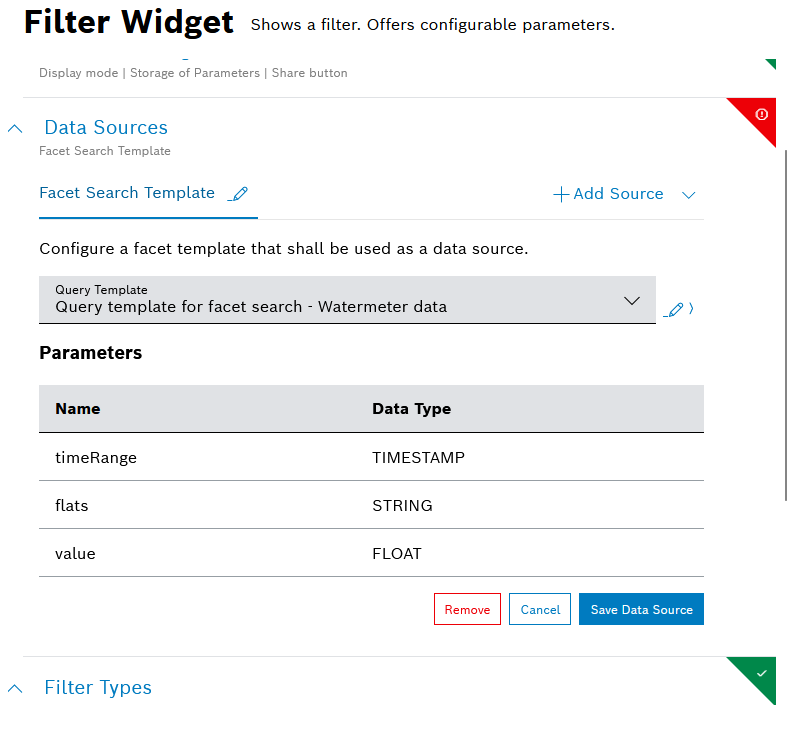
Click the Save Data Source button.
Single Device
Click the
 edit icon next to the data source label to define a unique label within the dashboard, if needed.
In the Default Device ID drop-down list, select a Device ID.
To connect the widget with the Filter widget you created for this dashboard, click the Available references icon
and select the Filter.Click the Source data preview icon
to open a preview.Click the Update Source button.
Multiple Devices
Click the
edit icon next to the data source label to define a unique label within the dashboard, if needed.In the Select Device Types drop-down list, select a device type.
Click the Advanced Settings button to narrow down the output.
In the Start field, enter a value to specify the device to start with.
Example: If you select 3, the first two devices are skipped.
In the Limit field, enter a value to specify the last device.
The maximum is 200 devices.
In the Fields field, enter the fields whose information shall be retrieved from Device Management.
In the Sort field, enter a field configured in Device Management according to which the data shall be sorted.
In the Namespaces field, add namespaces separated by a comma.
In the Filter field, add a filter to narrow down the search results. Placeholders are also supported.
Click the Source data preview icon
to open a preview.Click the Update Source button.
Device Count
The Device Count data source is based on the counting functionality in Device Management and is used to count things.
Click the
edit icon next to the data source label to define a unique label within the dashboard, if needed.In the Select Device Type drop-down list, select the device types/devices to be used as data source.
All Devices: Counts all devices regardless of the fact that they have a device type or not
All Device Types: Counts the devices that have the thing attribute type which means that the device belongs to a device type
Without Device Type: Counts the devices without the thing attribute type
Device Type xy: Counts the devices of the selected device types
Click the Advanced Settings button to narrow down the output.
In the Namespaces field, add namespaces separated by a comma.
In the DefaultFilter field, add a filter to narrow down the search results.
To connect the widget with the Filter widget you created for this dashboard, click the Available references icon
and select the Filter.Click the Source data preview icon
to open a preview.Click the Update Source button.
Devices from Filter Selection
Devices will be loaded that match the Device filter type configured in the Filter widget.
Click the
edit icon next to the data source label to define a unique label within the dashboard, if needed.In the Pagination Limit field, enter a limit of devices that shall be displayed per page.
In the Sort field, enter a property according to which the devices shall be sorted.
Click the Source data preview icon
to open a preview.Click the Update Source button.
Playback: All Frames
The Playback widget must have been configured for your dashboard.
Click the
edit icon next to the data source label to define a unique label within the dashboard, if needed.Select Playback: All Frames to display all data that has been recorded.
Playback: Current Frame
The Playback widget must have been configured for your dashboard.
Click the
edit icon next to the data source label to define a unique label within the dashboard, if needed.Select Playback: Current Frame to display the data that is just being recorded.
External Data Source
Using the external data source, an external endpoint can be specified to reference data.
Click the
edit icon next to the data source label to define a unique label within the dashboard, if needed.Select an HTTP method.
In the Request URL field, enter the URL of the request.
In the Type drop-down list, select the type of authorization.
Click the Set Configuration button to set up the selected authorization.
For Basic Auth:
In the Username field, enter the username.
In the Password field, enter the password.
For OAuth 2.0
In the Grant Type drop-down list, select the type of credentials.
Enter the Access Token URL.
Enter the Client ID.
Enter the Client Secret.
If you selected Password Credentials as Grant Type, also enter the Username and the Password .
For OAuth 2.0 (On-behalf grant type)
In the Grant Type drop-down list, select Azure AD On-Behalf.
Configure the scopes of your application API as described in External data source: on-behalf-of (OBO) flow.
If you selected the GET HTTP method:
In the Headers pane, enter a key and a value to specify the header information of the external system.
Activate the Secret Header checkbox to flag the header as secret.
When editing the data source, the header information has to be provided.
In the Test Parameters pane, enter a filter parameter to test it.
This pane can be used if a filter widget is configured for the dashboard. The filter values can be referenced as described in this pane within the URL and Headers.
Modifiers can be used to manipulate referenced filter values. The following modifiers are available:
noencode: Only used in URLs. The value is not encoded as it is done by default.
join: Concatenates multiple values in one string separating them with the provided separator.
replace: Replace multiple occurrences of a search pattern with a specified replacement pattern.
queryParams: Creates an entry with the provided parameterName for each value.
relativeTimestamp: Calculates a relative time according to the current time. It offers a way to dynamically change the time range with the use of the Filter widget, e.g. gt{$filterParams.dateTime.from | relativeTimestamp}
addTime:<insert number in milliseconds>: Calculates the relative time according to the given time from insights.timestamp and using the number from addTime, e.g. gt{insights.timestamp | addTime:-300000}. This modifier is designed for static usage so that a Filter widget is not required. A positive number is also allowed if relevant.
prefix: Allows to dynamically add parameters to a value, by means of a prefix, e.g. ${parameter2 | prefix: '&qp1='}. This modifier can also be used as part of an external data source. Undefined parameters will not resolve as "undefined" but will be omitted.
suffix: Allows to dynamically add parameters to a value, by means of a suffix, e.g. ${parameter2 | suffix: '&_qp1'}. This modifier can also be used as part of an external data source. Undefined parameters will not resolve as "undefined" but will be omitted.
Usage examples:
Example filter context:
{
"multi": ["v1", "v2"],
"mixedValues": ["v1", undefined, "v2"]
}
join:
${filterParams.multi | join: ','} will result in v1,v2
replace:
${filterParams.mixedValues | replace: 'undefined','N/A'} will result in ["v1","N/A","v2"]
queryParams:
${filterParams.multi | queryParams: 'multiParam'} will result in multiParam=v1&multiParam=v2
prefix:
${filterParams.multi | prefix: 'pre='} will result in pre=v1,pre=v2
suffix:
${filterParams.multi | suffix: '_suffix'} will result in v1_suffix,v2_suffix
Independently from the test parameters, user-specific information and randomly generated sequences (UUID v4, alphanumeric or hex string) can be referenced.
If you selected the PUT HTTP method:
In the Body pane, select the type of data in the Type drop-down list.
Activate the Secret Header checkbox to flag the header as secret.
When editing the data source, the header information has to be provided.
In the Test Parameters pane, enter a filter parameter to test it.
This pane can be used if a filter widget is configured for the dashboard. The filter values can be referenced as described in this pane within the URL, Headers and the Body.
Modifiers can be used to manipulate referenced filter values. The following modifiers are available:
noencode: Only used in URLs. The value is not encoded as it is done by default.
join: Concatenates multiple values in one string separating them with the provided separator.
replace: Replace multiple occurrences of a search pattern with a specified replacement pattern.
queryParams: Creates an entry with the provided parameterName for each value.
relativeTimestamp: Calculates a relative time according to the current time. It offers a way to dynamically change the time range with the use of the Filter widget, e.g. gt{$filterParams.dateTime.from | relativeTimestamp}
addTime:<insert number in milliseconds>: Calculates the relative time according to the given time from insights.timestamp and using the number from addTime, e.g. gt{insights.timestamp | addTime:-300000}. This modifier is designed for static usage so that a Filter widget is not required. A positive number is also allowed if relevant.
prefix: Allows to dynamically add parameters to a value, by means of a prefix, e.g. ${parameter2 | prefix: '&qp1='}. This modifier can also be used as part of an external data source. Undefined parameters will not resolve as "undefined" but will be omitted.
suffix: Allows to dynamically add parameters to a value, by means of a suffix, e.g. ${parameter2 | suffix: '&_qp1'}. This modifier can also be used as part of an external data source. Undefined parameters will not resolve as "undefined" but will be omitted.
Usage examples:
Example filter context:
{
"multi": ["v1", "v2"],
"mixedValues": ["v1", undefined, "v2"]
}
join:
${filterParams.multi | join: ','} will result in v1,v2
replace:
${filterParams.mixedValues | replace: 'undefined','N/A'} will result in ["v1","N/A","v2"]
queryParams:
${filterParams.multi | queryParams: 'multiParam'} will result in multiParam=v1&multiParam=v2
prefix:
${filterParams.multi | prefix: 'pre='} will result in pre=v1,pre=v2
suffix:
${filterParams.multi | suffix: '_suffix'} will result in v1_suffix,v2_suffix
Independently from the test parameters, user-specific information and randomly generated sequences (UUID v4, alphanumeric or hex string) can be referenced.
If you selected the POST HTTP method:
In the Body pane, select the type of data in the Type drop-down list.
Activate the Secret Header checkbox to flag the header as secret.
When editing the data source, the header information has to be provided.
In the Test Parameters pane, enter a filter parameter to test it.
This pane can be used if a filter widget is configured for the dashboard. The filter values can be referenced as described in this pane within the URL, Headers and the Body.
Modifiers can be used to manipulate referenced filter values. The following modifiers are available:
noencode: Only used in URLs. The value is not encoded as it is done by default.
join: Concatenates multiple values in one string separating them with the provided separator.
replace: Replace multiple occurrences of a search pattern with a specified replacement pattern.
queryParams: Creates an entry with the provided parameterName for each value.
relativeTimestamp: Calculates a relative time according to the current time. It offers a way to dynamically change the time range with the use of the Filter widget, e.g. gt{$filterParams.dateTime.from | relativeTimestamp}
addTime:<insert number in milliseconds>: Calculates the relative time according to the given time from insights.timestamp and using the number from addTime, e.g. gt{insights.timestamp | addTime:-300000}. This modifier is designed for static usage so that a Filter widget is not required. A positive number is also allowed if relevant.
prefix: Allows to dynamically add parameters to a value, by means of a prefix, e.g. ${parameter2 | prefix: '&qp1='}. This modifier can also be used as part of an external data source. Undefined parameters will not resolve as "undefined" but will be omitted.
suffix: Allows to dynamically add parameters to a value, by means of a suffix, e.g. ${parameter2 | suffix: '&_qp1'}. This modifier can also be used as part of an external data source. Undefined parameters will not resolve as "undefined" but will be omitted.
Usage examples:
Example filter context:
{
"multi": ["v1", "v2"],
"mixedValues": ["v1", undefined, "v2"]
}
join:
${filterParams.multi | join: ','} will result in v1,v2
replace:
${filterParams.mixedValues | replace: 'undefined','N/A'} will result in ["v1","N/A","v2"]
queryParams:
${filterParams.multi | queryParams: 'multiParam'} will result in multiParam=v1&multiParam=v2
prefix:
${filterParams.multi | prefix: 'pre='} will result in pre=v1,pre=v2
suffix:
${filterParams.multi | suffix: '_suffix'} will result in v1_suffix,v2_suffix
Independently from the test parameters, user-specific information and randomly generated sequences (UUID v4, alphanumeric or hex string) can be referenced.
In the Duration in seconds field under Caching, specify the caching duration in seconds.
Click the Source data preview icon
to open a preview.Click the Save Data Source button.
Filter Types
Expand the Filter Types section to configure global, general, and device filters.
Click the Add Global Filter drop-down list and select a global filter that was added in another dashboard.
Activate the Device Filters switch to configure a filter on the properties of a device type.
For information on how to configure information blocks and properties of device types, refer to Managing information blocks.
This device filter can be used as data source of multiple widgets. For that, you need to select the Devices from Filter Selection option from the Add source drop-down list.
In the Type drop-down field, select a device type.
In the Search Properties field, enter or select the desired properties.
→ Each property is added below and can be further configured.In the Display Name field, change the name that will be displayed.
Activate the Allow multiple filter values checkbox to provide a multi-selection for the filter.
→ You will be able to choose several filtering criteria from a pick list. If you do not activate Allow multiple filter values checkbox, you will be able to select the criteria from a dropdown menu.Activate the Mark as required checkbox to have the user fill out this filter parameter.
Activate the Mark as Global Filter field to make this filter available for use on other dashboards.
Global Filter fields will be available in the Add Global Filter dropdown and can be shared across different filter widgets. Modifying a global filter will impact all dashboards using it.
Activate the Default Value checkbox or enter a default value in the field.
Open the Advanced Settings pane to further configure the filter parameter.
Activate the Hide filter parameter in dashboard checkbox to hide the filter option in the widget.
In the Technical Name field, enter a technical name.
Activate the General Filters switch.
Click the Add filter drop-down list and select a filter parameter.
→ The filter parameter is added and can be configured as described in the following sections.To remove a parameter, click the Remove Parameter button at the bottom of the corresponding filter parameter.
Text parameter
In the Display Name field, enter a name that will be displayed.
In the Display Name field, click the EN drop-down list and select Add DE: German to add the German equivalent.
Activate the Allow multiple filter values checkbox to provide a multi-selection for the filter.
→ You will be able to enter multiple text values.Activate the Mark as required checkbox to have the user enter text in the search box.
Activate the Mark as Global Filter checkbox to make this filter parameter globally available for other dashboards.
Global Filter fields will be available in the Add Global Filter dropdown and can be shared across different filter widgets. Modifying a global filter will impact all dashboards using it.
In the Text Default Value field, enter any text that gives the user an idea of what to search for.
Open the Advanced Settings pane to further configure the filter parameter.
Activate the Hide filter parameter in dashboard checkbox to hide the filter option in the widget.
In the Technical Name field, enter a technical name.
Number parameter
In the Display Name field, enter a name that will be displayed.
In the Display Name field, click the EN drop-down list and select Add DE: German to add the German equivalent.
Activate the Mark as required checkbox to have the user enter text in the search box.
Activate the Mark as Global Filter checkbox to make this filter parameter globally available for other dashboards.
Global Filter fields will be available in the Add Global Filter dropdown and can be shared across different filter widgets. Modifying a global filter will impact all dashboards using it.
Open the Advanced Settings pane to further configure the filter parameter.
Activate the Hide filter parameter in dashboard checkbox to hide the filter option in the widget.
In the Technical Name field, enter a technical name.
Date Time Range parameter
In the Display Name field, enter a name that will be displayed.
In the Display Name field, click the EN drop-down list and select Add DE: German to add the German equivalent.
Activate the Allow multiple filter values checkbox to provide a multi-selection for the filter.
→ You will be able to choose several date time ranges.Activate the Mark as required checkbox to have the user select the time.
Activate the Mark as Global Filter checkbox to make this filter parameter globally available for other dashboards.
Global Filter fields will be available in the Add Global Filter dropdown and can be shared across different filter widgets. Modifying a global filter will impact all dashboards using it.
Activate the Enable Time Selection checkbox to also filter the time.
Activate the Allow Relative Time checkbox to define a duration of time relative to the current time.
Click the Default Value field to define the range.
Absolute: Select the exact date (and time).
Relative: Select the duration of the time relative to the current time.
Presets: Select a preconfigured time filter.
Open the Advanced Settings pane to further configure the filter parameter.
Activate the Hide filter parameter in dashboard checkbox to hide the filter option in the widget.
In the Technical Name field, enter a technical name.
If you have selected the data source type Facet Search Template, activate the Facet search field checkbox.
The configured date time range parameter can be combined with the Playback widget.
Checkbox parameter
In the Display Name field, enter a name that will be displayed.
In the Display Name field, click the EN drop-down list and select Add DE: German to add the German equivalent.
Activate the Mark as required checkbox to have the user activate the checkbox.
Activate the Mark as Global Filter checkbox to make this filter parameter globally available for other dashboards.
Global Filter fields will be available in the Add Global Filter dropdown and can be shared across different filter widgets. Modifying a global filter will impact all dashboards using it.
Activate the Default Value checkbox to set this checkbox as default.
Open the Advanced Settings pane to further configure the filter parameter.
Activate the Hide filter parameter in dashboard checkbox to hide the filter option in the widget.
In the Technical Name field, enter a technical name.
Selection parameter
In the Display Name field, enter a name that will be displayed.
In the Display Name field, click the EN drop-down list and select Add DE: German to add the German equivalent.
Activate the Allow multiple filter values checkbox to provide a multi-selection for the filter.
→ You will be able to choose several filtering criteria from a pick list. If you do not activate Allow multiple filter values checkbox, you will be able to select the criteria from a dropdown menu.Activate the Mark as required checkbox to have the user select something.
Activate the Mark as Global Filter checkbox to make this filter parameter globally available for other dashboards.
Global Filter fields will be available in the Add Global Filter dropdown and can be shared across different filter widgets. Modifying a global filter will impact all dashboards using it.
In the Label - Value table, add a label and a value that will be displayed in the widget.
Click the Add row button to add another row to the selection. Repeat this step until you have all desired values.
In the Default Value drop-down list, select one of the added values to be the default value.
Open the Advanced Settings pane to further configure the filter parameter.
Activate the Hide filter parameter in dashboard checkbox to hide the filter option in the widget.
In the Technical Name field, enter a technical name.
If you have selected the data source type Facet Search Template, activate the Facet search field checkbox.
Device parameter
In the Display Name field, enter a name that will be displayed.
In the Display Name field, click the EN drop-down list and select Add DE: German to add the German equivalent.
Activate the Allow multiple filter values checkbox to provide a multi-selection for the filter.
→ You will be able to choose several filtering criteria from a pick list. If you do not activate Allow multiple filter values checkbox, you will be able to select the criteria from a dropdown menu.Activate the Mark as required checkbox to have the user enter text in the search box.
Activate the Mark as Global Filter checkbox to make this filter parameter globally available for other dashboards.
Global Filter fields will be available in the Add Global Filter dropdown and can be shared across different filter widgets. Modifying a global filter will impact all dashboards using it.
In the Value Path field, enter the path to a specific device property from your connected Bosch IoT Things service instance.
In the Device types to be visible drop-down list, select the device types that will be displayed in the widget.
In the Filter filed, add a filter to narrow down the search results. Placeholders are also supported for referencing dynamic data from another filter, or Insights context, etc.
Open the Advanced Settings pane to further configure the filter parameter.
Activate the Hide filter parameter in dashboard checkbox to hide the filter option in the widget.
In the Technical Name field, enter a technical name.
If you have selected the data source type Facet Search Template, activate the Facet search field checkbox.
Query Condition parameter
In the Display Name field, enter a name that will be displayed.
In the Display Name field, click the EN drop-down list and select Add DE: German to add the German equivalent.
Activate the Mark as required checkbox to have the user enter text in the search box.
Activate the Mark as Global Filter checkbox to make this filter parameter globally available for other dashboards.
Global Filter fields will be available in the Add Global Filter dropdown and can be shared across different filter widgets. Modifying a global filter will impact all dashboards using it.
In the Path field, use the drop-down list to select a path that you want to search.
Select an operator.
In the Data Type drop-down list, select a data type which matches your data type of the path.
String: a simple text value
Number: an integer value
Object ID: an ID of an object stored in the database
Date: a date value
Date Range: a from-to value range
In the Value field, enter any value you want to search for.
Click the Add Condition button to add another condition.
Open the Advanced Settings pane to further configure the filter parameter.
Activate the Hide filter parameter in dashboard checkbox to hide the filter option in the widget.
In the Technical Name field, enter a technical name.
Sharing the filter widget
Refer to General widgets > Additional functions of filter widgets.
Enabling the faceted search
Refer to General widgets > Additional functions of filter widgets and Tutorials > Configuring the faceted search.