Rich Text widget
The Rich Text widget allows you to display formatted static and dynamic text, as well as links, images, and tables in order to provide for example a description of your project.
The widget offers a basic set of useful text processing functionalities, which are applicable to both static and dynamic text, in particular:
Text formatting:
Font size
Bold, italic, underline, and
strikethroughQuotes
Code blocks
Level 1 and level 2 headings (H1, H2)
Ordered or unordered lists
Indented text
Text and background color
Text alignment
Clearing the formatting
Adding links, images, and tables
Example
Proceed as follows
On your relevant dashboard, click the Add Widget button.
Select the Rich Text widget in the widget list.
→ The widget configuration page is displayed.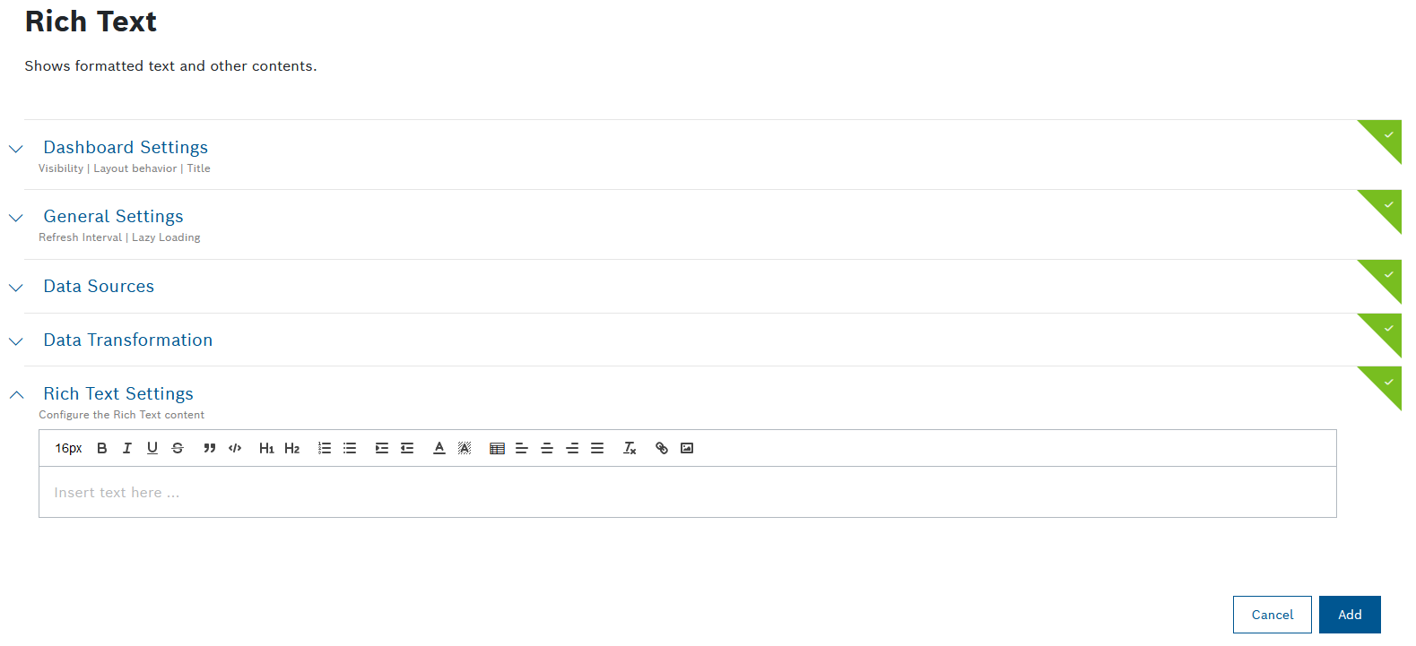
Configure the settings as described below.
Click the Add button.
→ The widget is added to the dashboard.
Dashboard Settings
Open the Dashboard Settings pane to set how the widget is displayed in the dashboard.
In the Size drop-down list, decide how much space the widget should take in the form of columns.
In the Title field, enter a title for the widget.
For a dynamic title, you can add placeholders with the ${...} notation. Possible placeholder sources are filterParams (if a filter widget exists on the dashboard, e.g. ${filterParams.paramName}) or data from the data source (if source is specified, e.g. ${[0].payload.value}), insights (user context), dashboardName or widgetId.
In the Visibility drop-down, set whether the widget should be visible or hidden. You can also define for which specific roles the widget will be shown or not. This setting allows you to customize dashboards for specific user groups that have a certain role.
Visible: The widget is visible for all (default)
Visible for roles: The widget is visible if any of the selected roles matches one of the user's project role
Hidden: The widget is hidden for all
Hidden for roles: The widget is hidden if any of the selected roles matches one of the user's project roleIn the Layout behavior drop-down list, decide how the size of the widget should be adapted in the dashboard.
In the Collapsible widget content field, select one of the following options:
Yes (collapsed on initial load): The widget will be collapsed on the initial load, however, the latest state (expanded or collapsed) will be saved in the local storage.
Yes (expanded on initial load): The widget will be expanded on the initial load, however, the latest state (expanded or collapsed) will be saved in the local storage.
No: The widget will not be collapsible.
The Collapsible widget content option is available only for dashboards with the grid-based layout.
If this option is enabled, the widget content can be collapsed and expanded on demand by the user to save space or hide irrelevant content based on personal interest. Keep in mind that a widget that is currently collapsed on a dashboard cannot be exported.
When the rearranging option is enabled, any collapsed widgets will be automatically expanded. On the compact layout these auto-expanded widgets will be automatically rearranged, whereas on the free-floating grid, they will remain where they are.
General Settings
Open the General Settings pane to configure some general aspects for the widget.
In the Widget Refresh Interval in Seconds field, enter a value in seconds after which the widget should be refreshed.
In the Lazy Loading drop-down list, select whether you want to enable or disable lazy loading.
Lazy loading is enabled by default. That way, widgets are only loaded when they are visible on screen. This prevents slower loading of the dashboard and performance issues.
The configuration of a data source in the Rich Text widget is optional. If you want to use placeholders, it is necessary to define a data source.
Data Sources
Open the Data Sources pane to configure the data source for the widget.
You can select a maximum of five data sources.
You can choose between a new data source and an existing data source, i.e. a data source which has already been configured on another widget on the same dashboard. The shared data source's configuration can be edited on any of the widgets that are using it, and such changes will be reflected on all respective widgets. Likewise, when one of these widgets is refreshed, the new data will be displayed on all widgets which use the same data source.
The fact that a data source is shared is indicated by a link icon next to its label. Using a shared data source will improve the dashboard's performance, ensure faster loading times and avoid redundant calls to the backend.
To avoid conflicts, every data source must have a unique label within the dashboard.
Click the + Add Source button to add a data source.
Select any of the following options further explained underneath:
New data source:
Existing data source:
The list in this group displays all shared data sources from other widgets on the dashboard
Query Template
Click the edit icon next to the data source label to define a unique label within the dashboard, if needed.
In the Query Template drop-down list, select a query template that you configured under Explore > Data Explorer, refer to Creating a query template.
A query template is a template that has been created, parameterized, and provided for others. It is similar to an SQL View and shows data in a table view.
To connect the widget with the Filter widget you created for this dashboard, click the Available references icon
 and select the Filter.
If you have a time parameter, you can choose between absolute time, relative time, and a preset by clicking the time icon
 .
.There is a Target collection parameter, if the selected query template allows multiple target collections. Select one of the allowed collections from the drop-down list, or select a dynamic reference using the Available references icon
.For Caching, add the Duration in seconds to load existing cache entries that match your parameters during that time frame.
The default cache time of 30 minutes is set automatically.
Click the Source data preview icon
 to open a preview.
Click the Save Data Source button.
Single Device
Click the
 edit icon next to the data source label to define a unique label within the dashboard, if needed.
In the Default Device ID drop-down list, select a Device ID.
To connect the widget with the Filter widget you created for this dashboard, click the Available references icon
and select the Filter.Click the Source data preview icon
to open a preview.Click the Update Source button.
Multiple Devices
Click the
edit icon next to the data source label to define a unique label within the dashboard, if needed.In the Select Device Types drop-down list, select a device type.
Click the Advanced Settings button to narrow down the output.
In the Start field, enter a value to specify the device to start with.
Example: If you select 3, the first two devices are skipped.
In the Limit field, enter a value to specify the last device.
The maximum is 200 devices.
In the Fields field, enter the fields whose information shall be retrieved from Device Management.
In the Sort field, enter a field configured in Device Management according to which the data shall be sorted.
In the Namespaces field, add namespaces separated by a comma.
In the Filter field, add a filter to narrow down the search results. Placeholders are also supported.
Click the Source data preview icon
to open a preview.Click the Update Source button.
Device Count
The Device Count data source is based on the counting functionality in Device Management and is used to count things.
Click the
edit icon next to the data source label to define a unique label within the dashboard, if needed.In the Select Device Type drop-down list, select the device types/devices to be used as data source.
All Devices: Counts all devices regardless of the fact that they have a device type or not
All Device Types: Counts the devices that have the thing attribute type which means that the device belongs to a device type
Without Device Type: Counts the devices without the thing attribute type
Device Type xy: Counts the devices of the selected device types
Click the Advanced Settings button to narrow down the output.
In the Namespaces field, add namespaces separated by a comma.
In the DefaultFilter field, add a filter to narrow down the search results.
To connect the widget with the Filter widget you created for this dashboard, click the Available references icon
and select the Filter.Click the Source data preview icon
to open a preview.Click the Update Source button.
Devices from Filter Selection
Devices will be loaded that match the Device filter type configured in the Filter widget.
Click the
edit icon next to the data source label to define a unique label within the dashboard, if needed.In the Pagination Limit field, enter a limit of devices that shall be displayed per page.
In the Sort field, enter a property according to which the devices shall be sorted.
Click the Source data preview icon
to open a preview.Click the Update Source button.
Playback: All Frames
The Playback widget must have been configured for your dashboard.
Click the
edit icon next to the data source label to define a unique label within the dashboard, if needed.Select Playback: All Frames to display all data that has been recorded.
Playback: Current Frame
The Playback widget must have been configured for your dashboard.
Click the
edit icon next to the data source label to define a unique label within the dashboard, if needed.Select Playback: Current Frame to display the data that is just being recorded.
External Data Source
Using the external data source, an external endpoint can be specified to reference data.
Click the
edit icon next to the data source label to define a unique label within the dashboard, if needed.Select an HTTP method.
In the Request URL field, enter the URL of the request.
In the Type drop-down list, select the type of authorization.
Click the Set Configuration button to set up the selected authorization.
For Basic Auth:
In the Username field, enter the username.
In the Password field, enter the password.
For OAuth 2.0
In the Grant Type drop-down list, select the type of credentials.
Enter the Access Token URL.
Enter the Client ID.
Enter the Client Secret.
If you selected Password Credentials as Grant Type, also enter the Username and the Password .
For OAuth 2.0 (On-behalf grant type)
In the Grant Type drop-down list, select Azure AD On-Behalf.
Configure the scopes of your application API as described in External data source: on-behalf-of (OBO) flow.
If you selected the GET HTTP method:
In the Headers pane, enter a key and a value to specify the header information of the external system.
Activate the Secret Header checkbox to flag the header as secret.
When editing the data source, the header information has to be provided.
In the Test Parameters pane, enter a filter parameter to test it.
This pane can be used if a filter widget is configured for the dashboard. The filter values can be referenced as described in this pane within the URL and Headers.
Modifiers can be used to manipulate referenced filter values. The following modifiers are available:
noencode: Only used in URLs. The value is not encoded as it is done by default.
join: Concatenates multiple values in one string separating them with the provided separator.
replace: Replace multiple occurrences of a search pattern with a specified replacement pattern.
queryParams: Creates an entry with the provided parameterName for each value.
relativeTimestamp: Calculates a relative time according to the current time. It offers a way to dynamically change the time range with the use of the Filter widget, e.g. gt{$filterParams.dateTime.from | relativeTimestamp}
addTime:<insert number in milliseconds>: Calculates the relative time according to the given time from insights.timestamp and using the number from addTime, e.g. gt{insights.timestamp | addTime:-300000}. This modifier is designed for static usage so that a Filter widget is not required. A positive number is also allowed if relevant.
prefix: Allows to dynamically add parameters to a value, by means of a prefix, e.g. ${parameter2 | prefix: '&qp1='}. This modifier can also be used as part of an external data source. Undefined parameters will not resolve as "undefined" but will be omitted.
suffix: Allows to dynamically add parameters to a value, by means of a suffix, e.g. ${parameter2 | suffix: '&_qp1'}. This modifier can also be used as part of an external data source. Undefined parameters will not resolve as "undefined" but will be omitted.
Usage examples:
Example filter context:
{
"multi": ["v1", "v2"],
"mixedValues": ["v1", undefined, "v2"]
}
join:
${filterParams.multi | join: ','} will result in v1,v2
replace:
${filterParams.mixedValues | replace: 'undefined','N/A'} will result in ["v1","N/A","v2"]
queryParams:
${filterParams.multi | queryParams: 'multiParam'} will result in multiParam=v1&multiParam=v2
prefix:
${filterParams.multi | prefix: 'pre='} will result in pre=v1,pre=v2
suffix:
${filterParams.multi | suffix: '_suffix'} will result in v1_suffix,v2_suffix
Independently from the test parameters, user-specific information and randomly generated sequences (UUID v4, alphanumeric or hex string) can be referenced.
If you selected the PUT HTTP method:
In the Body pane, select the type of data in the Type drop-down list.
Activate the Secret Header checkbox to flag the header as secret.
When editing the data source, the header information has to be provided.
In the Test Parameters pane, enter a filter parameter to test it.
This pane can be used if a filter widget is configured for the dashboard. The filter values can be referenced as described in this pane within the URL, Headers and the Body.
Modifiers can be used to manipulate referenced filter values. The following modifiers are available:
noencode: Only used in URLs. The value is not encoded as it is done by default.
join: Concatenates multiple values in one string separating them with the provided separator.
replace: Replace multiple occurrences of a search pattern with a specified replacement pattern.
queryParams: Creates an entry with the provided parameterName for each value.
relativeTimestamp: Calculates a relative time according to the current time. It offers a way to dynamically change the time range with the use of the Filter widget, e.g. gt{$filterParams.dateTime.from | relativeTimestamp}
addTime:<insert number in milliseconds>: Calculates the relative time according to the given time from insights.timestamp and using the number from addTime, e.g. gt{insights.timestamp | addTime:-300000}. This modifier is designed for static usage so that a Filter widget is not required. A positive number is also allowed if relevant.
prefix: Allows to dynamically add parameters to a value, by means of a prefix, e.g. ${parameter2 | prefix: '&qp1='}. This modifier can also be used as part of an external data source. Undefined parameters will not resolve as "undefined" but will be omitted.
suffix: Allows to dynamically add parameters to a value, by means of a suffix, e.g. ${parameter2 | suffix: '&_qp1'}. This modifier can also be used as part of an external data source. Undefined parameters will not resolve as "undefined" but will be omitted.
Usage examples:
Example filter context:
{
"multi": ["v1", "v2"],
"mixedValues": ["v1", undefined, "v2"]
}
join:
${filterParams.multi | join: ','} will result in v1,v2
replace:
${filterParams.mixedValues | replace: 'undefined','N/A'} will result in ["v1","N/A","v2"]
queryParams:
${filterParams.multi | queryParams: 'multiParam'} will result in multiParam=v1&multiParam=v2
prefix:
${filterParams.multi | prefix: 'pre='} will result in pre=v1,pre=v2
suffix:
${filterParams.multi | suffix: '_suffix'} will result in v1_suffix,v2_suffix
Independently from the test parameters, user-specific information and randomly generated sequences (UUID v4, alphanumeric or hex string) can be referenced.
If you selected the POST HTTP method:
In the Body pane, select the type of data in the Type drop-down list.
Activate the Secret Header checkbox to flag the header as secret.
When editing the data source, the header information has to be provided.
In the Test Parameters pane, enter a filter parameter to test it.
This pane can be used if a filter widget is configured for the dashboard. The filter values can be referenced as described in this pane within the URL, Headers and the Body.
Modifiers can be used to manipulate referenced filter values. The following modifiers are available:
noencode: Only used in URLs. The value is not encoded as it is done by default.
join: Concatenates multiple values in one string separating them with the provided separator.
replace: Replace multiple occurrences of a search pattern with a specified replacement pattern.
queryParams: Creates an entry with the provided parameterName for each value.
relativeTimestamp: Calculates a relative time according to the current time. It offers a way to dynamically change the time range with the use of the Filter widget, e.g. gt{$filterParams.dateTime.from | relativeTimestamp}
addTime:<insert number in milliseconds>: Calculates the relative time according to the given time from insights.timestamp and using the number from addTime, e.g. gt{insights.timestamp | addTime:-300000}. This modifier is designed for static usage so that a Filter widget is not required. A positive number is also allowed if relevant.
prefix: Allows to dynamically add parameters to a value, by means of a prefix, e.g. ${parameter2 | prefix: '&qp1='}. This modifier can also be used as part of an external data source. Undefined parameters will not resolve as "undefined" but will be omitted.
suffix: Allows to dynamically add parameters to a value, by means of a suffix, e.g. ${parameter2 | suffix: '&_qp1'}. This modifier can also be used as part of an external data source. Undefined parameters will not resolve as "undefined" but will be omitted.
Usage examples:
Example filter context:
{
"multi": ["v1", "v2"],
"mixedValues": ["v1", undefined, "v2"]
}
join:
${filterParams.multi | join: ','} will result in v1,v2
replace:
${filterParams.mixedValues | replace: 'undefined','N/A'} will result in ["v1","N/A","v2"]
queryParams:
${filterParams.multi | queryParams: 'multiParam'} will result in multiParam=v1&multiParam=v2
prefix:
${filterParams.multi | prefix: 'pre='} will result in pre=v1,pre=v2
suffix:
${filterParams.multi | suffix: '_suffix'} will result in v1_suffix,v2_suffix
Independently from the test parameters, user-specific information and randomly generated sequences (UUID v4, alphanumeric or hex string) can be referenced.
In the Duration in seconds field under Caching, specify the caching duration in seconds.
Click the Source data preview icon
to open a preview.Click the Save Data Source button.
Data Transformation
With the data transformation activated, you can select entries from arrays in arrays or a specific range of arrays.
Also refer to the JMESPath documentation.
Open the Data Transformation pane to activate the data transformation to JMES.
Activate the toggle switch.
In the Filter field, add a string to filter the data, e.g. [0] to display only the first item or [?contains(thingId,'yourThingName')] to filter by contains in the thingId property.
Click the Transformed data preview icon
 to open a preview.
→ The data transformation is activated for the widget.
If you selected more than one data source, the Data Aggregator pane is displayed.
Activate the toggle switch.
In the Data Aggregator drop-down list, select an aggregation method with which each entry of the same index is merged into one result.
Activate the Merge Properties checkbox to merge the properties of the index.
In the Filter field, add a string to filter the data, e.g. [0] to display only the first item or [?contains(thingId,'yourThingName')] to filter by contains in the thingId property.
Click the Transformed data preview icon
to open a preview.
→ The data transformation is activated for the widget.
Rich Text Settings
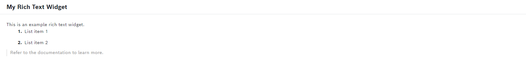
In the text box, you can add static and dynamic text, links, images, and tables using the functionalities mentioned above.
Adding dynamic text
If you have selected a data source, you can display dynamic text in the Rich Text widget by adding placeholders.
Add text to the text box.
To add a placeholder, type ${ and select a parameter path from the list that is displayed, e.g., .thingId.
If there are filter parameters available, they can also be referenced using ${, e.g., ${filterParam.name} which displays the name value from the URL arguments.
→ The Rich Text widget displays the value of the parameter path you have selected.
Optionally, add a tooltip for the displayed value. Proceed as follows:
Left-click on the added dynamic text.
In the dialog that opens, click Tooltip.
In the Text field, define the content which should be displayed as a tooltip.
You can add static content or use placeholders to customize the tooltip text, e.g. 'My tooltip value ${[i].payload.value}'.
If you are adding a tooltip for a dynamic value which is an array, it is possible to add a separate tooltip for each array entry. This only works if the given tooltip array has the same length as the value array.
In case a parameter in the tooltip is null, invalid, or missing, the tooltip will not be displayed for the users, and a warning will be printed on the console.
See also Data type handling & formatting below.
Adding links
If you have selected a data source, you can add dynamic links.
Click the link icon
 to add a link to the text box.
→ The Set Link dialog is displayed.In the Link URL field, enter a:
URL
You can add placeholders to the link from the selected data source or filter parameters, e.g. https://yourdomain.com/${[0].payload.deviceId}.
File link
As opening a file link is considered a potential security risk, it is restricted by modern web clients.
Therefore, in order to open this link from the widget later on, you can copy it from a dialog which appears when the link is clicked, and then paste it into your file explorer.
Make sure that the link is trustable and correct before using it.
In the Link Tooltip field, enter a description of the link.
→ This description is displayed upon hovering over the link.In the Action drop-down list, select whether the hyperlink shall be opened in the same tab, opened in a new tab, or copied to clipboard.
Click the Save button to add the link.
Adding images
If you have selected a data source, you can add device images, Base64 images, images from a URL, or images from a file to the Rich Text widget.
Click the image icon
 to upload an image from a source as specified above.
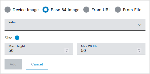
Device Image
In the Value drop-down list, select a parameter path.
The base64 image string must be added to a property in a General or Details information block.
In the Max Height field, enter the height of the image in pixels.
In the Max Width field, enter the width of the image in pixels.
Click the Add button to add the device image to the widget.
Base 64 Image
In the Value drop-down list, select a parameter path, e.g. [0].features.general.properties.base64image.
The base64 image string must be added to a property in a General or Details information block.
In the Max Height field, enter the height of the image in pixels.
In the Max Width field, enter the width of the image in pixels.
Click the Add button to add the Base64 image to the widget.
From URL
In the URL field, add either a project-specific URL with placeholders or an external link.
In the Max Height field, enter the height of the image in pixels.
In the Max Width field, enter the width of the image in pixels.
Click the Add button to add the image from the URL to the widget.
From File
Click the From File field to upload a file.
Select a file.
In the Max Height field, enter the height of the image in pixels.
In the Max Width field, enter the width of the image in pixels.
Click the Add button to add the file to the widget.
Data type handling & formatting
This information applies when you have added dynamic text, see Adding dynamic text above.
Left-click on the added dynamic text.
In the dialog that opens, click Data type handling & formatting.
In the General handling section, select a data type in Type drop-down list.
In the drop-down list next to the Prefix field, select one of the following options:
Value
Enter any value as a prefix, e.g., €.Data Source
Select a parameter path from the drop-down list.User Context
Select user information to be displayed as prefix, e.g., User ID, User Email, or the time zone.Filter Widget
Select the Filter widget you added to the dashboard.
In the drop-down list next to the Suffix field, select one of the following options:
Value
Enter any value as a suffix, e.g., %.Data Source
Select a parameter path from the drop-down list.User Context
Select user information to be displayed as suffix, e.g., User ID, User Email, or the time zone.Filter Widget
Select the Filter widget you added to the dashboard.
Activate the Hide value (no text) checkbox to hide the value and only display the background color.
In the Type-specific options pane, define settings depending on the data type you selected.
If you selected Number in step 1, activate the Thousands separator checkbox and select the number of Decimal Digits for behind the comma.
If you selected Date/Time in step 1, activate the Disable time zone conversion (Date and time is shown as UTC) checkbox to use UTC.
In the Background color pane, configure the background color of the column.
If you activate the Static checkbox:
In the drop-down list next to the Color field, select one of the following options:
Value
Click the color square to select another color or enter a color code.Data Source
Select a parameter path from the drop-down list.User Context
Select user information to be displayed, e.g., User ID, User Email, or the time zone.Filter Widget
Select the Filter widget you added to the dashboard.
If you activate the Range checkbox:
In the drop-down list next to the Default Color field, select one of the following options:
Value
Click the color square to select another color or enter a color code.Data Source
Select a parameter path from the drop-down list.User Context
Select user information to be displayed, e.g., User ID, User Email, or the time zone.Filter Widget
Select the Filter widget you added to the dashboard.
Click the Add range button to set a range in which a specific color shall be displayed.
In the drop-down list next to the Color field, select one of the following options:
Value
Click the color square to select another color or enter a color code.Data Source
Select a parameter path from the drop-down list.User Context
Select user information to be displayed, e.g., User ID, User Email, or the time zone.Filter Widget
Select the Filter widget you added to the dashboard.
If you selected Number in step 1, add values to the From and To fields to which the color applies.
If you selected String in step 1, set a dynamic background color with regular expressions to have the color of the row depend on the result of the regular expressions.
If you selected Date/Time in step 1, add values to the From and To fields to which the color applies.
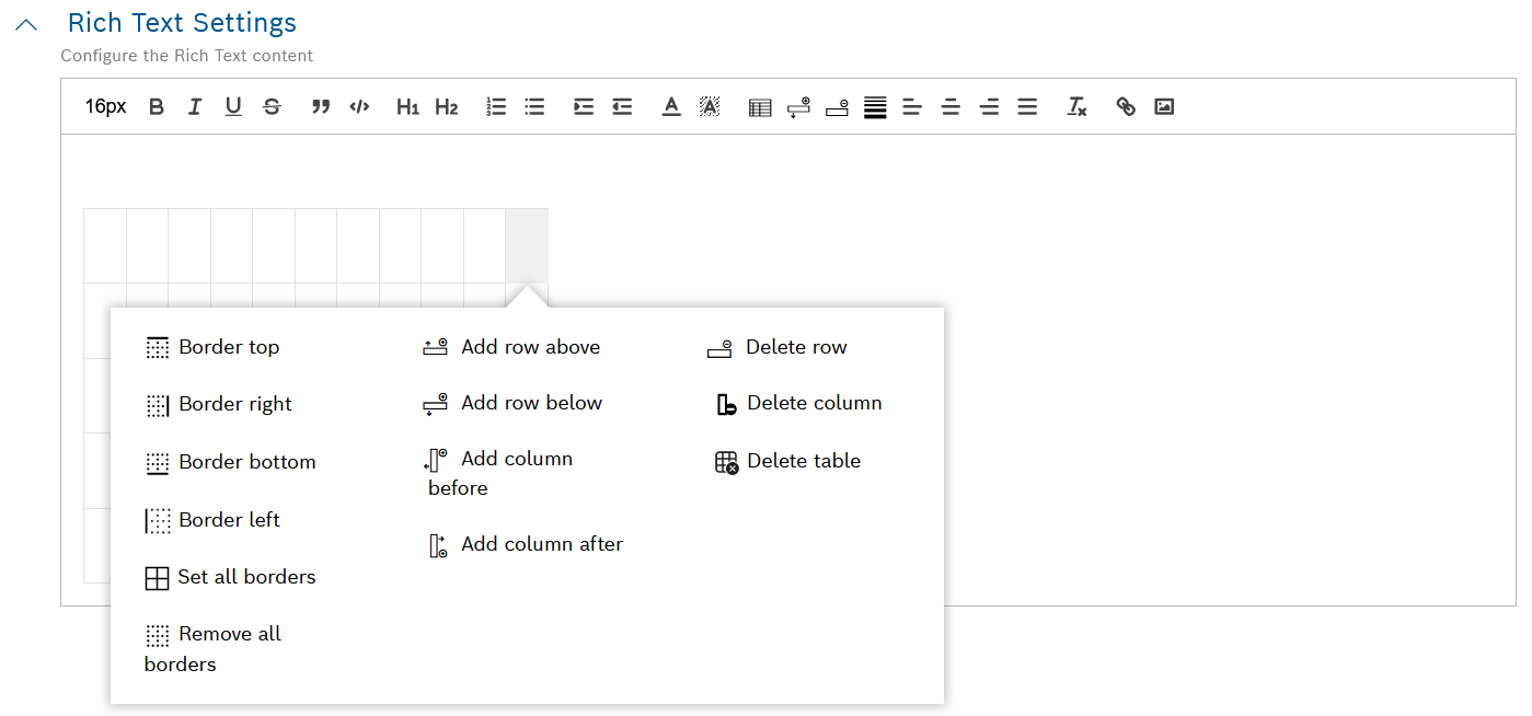
Adding tables
To add a table to the rich text content:
Click the table icon
 in the toolbar.
Select the desired number of rows and columns from the dialog that opens.
→ The table is displayed in the rich text content configuration area.
→ Additional icons for table formatting appear in the toolbar.To access the full table formatting options, right-click on the newly added table.
→ Use the respective buttons to adjust the table borders, add and delete rows and columns, as well as to delete the entire table.Add any relevant content to the table, such as:
Static text
→ Type the relevant textDynamic text
→ See Adding dynamic text aboveLinks
→ See Adding links aboveImages
→ See Adding images above
If needed, apply the relevant text formatting through the respective buttons in the toolbar, e.g. font size, headings, etc.
→ See the full list of text formatting options on the top of this page.