Integrating machine learning in Bosch IoT Insights
In Bosch IoT Insights, you can integrate machine learning for example with the help of TensorFlow. Tensorflow is an open-source platform to train and infer deep neural networks. In this tutorial, Tensorflow will help us to recognize hand-written digits on images. To do so, we will train a model in an IDE and create a pipeline in Bosch IoT Insights. At the end, we will have a look at the predicted digits in the Data Browser and a preconfigured dashboard. Refer to the TensorFlow beginner's tutorial.
For more information on data processing and the configuration of pipelines, refer to the following chapters:
Prerequisites
You need to have a paid plan of Bosch IoT Insights. (The free plan does not include pipelines.)
You are an Admin in your project.
You have Python installed and set up a virtual environment in your desired IDE.
If you are behind a proxy, make sure that your IDE can access the internet.
Provided material:
Contents of the provided material in the attachment: TensorFlow_Tutorial.zip
dev-requirements.txt
Installs all required dependencies for this tutorial.requirements.txt
Shows the version of Pymongo and TensorFlow that will be installed.executable_manifest.yaml
Technical description of the artifact for the Bosch IoT Insights pipeline.model_training.py
Trains the TensorFlow model to recognize the digits 0-9.mnist_export.py
Exports the data set that contains 60.000 images just for training and 10.000 more for testing.By running this script, the MNIST data set with all images is exported. This is not part of the tutorial but only for your information.
custom_prediction_watcher.py
Takes the step.py and simulates the process with the handwritten images the same way as it will later run in Bosch IoT Insights.tests folder
Contains the images with hand-written digits from 0 to 9.test.py
Takes the images and converts them into JSON format.step.py
Python script that contains the processing logic.insights_protocol.py
All encoding and decoding functions are moved from the main script to this file. This file is imported into the step.py.deploy_artifact.py
Deploys all artifacts to your Bosch IoT Insights project.
The example code is licensed in a way that it allows the usage of it but it should only be used for demonstration purposes and not in productive environments. We simplified it for the sake of clarity, so no failure handling and security checks are performed.
The content of the Integrating machine learning in Bosch IoT Insights tutorial is also available as a video here.

This chapter details the following topics:
Downloading the provided ZIP folder
As a first step, we will download the provided ZIP folder.
Proceed as follows
Unzip the provided folder.
Open your IDE.
Open the folder in your IDE.
Open a terminal.
Training the TensorFlow model
To train the TensorFlow model to recognize the digits 0-9, we need to run some commands in an IDE. At last, we will upload the modified contents necessary for the custom step of the pipeline to Bosch IoT Insights.
Proceed as follows
To create a virtual environment, run the py -3.7 -m venv . command.
To activate the virtual environment, run the Scripts\activate command.
To install everything listed in the dev-requirements.txt file, run the pip install -r dev-requirements.txt.
To train the TensorFlow model to recognize the digits 0-9, run the model_training.py.
→ The images used for training are provided with the MNIST dataset. The data set contains 60.000 images just for training and 10.000 more for testing. The accuracy of each iteration will be displayed at the end.To test the trained model, run the custom_prediction_watcher.py.
→ This python script takes the step.py and simulates the process the same way as it will later run in Bosch IoT Insights. At the end, you will see an overview of the results for all digits.To deploy all artifacts to your Bosch IoT Insights project, open the deploy_artifact.py.
In line 16, enter your project name.
Create an API user in your Bosch IoT Insights project as described in the Creating an API user in Bosch IoT Insights section.
In lines 18 and 20, enter the credentials of the API user.
Run the deploy_artifact.py.
→ The artifacts are deployed to your Bosch IoT Insights project. When you create the custom step of the pipeline, the ZIP folder is already there.
Creating an API user in Bosch IoT Insights
To send device data via the HTTP Data Recorder, the credentials of an API user are required. In Bosch IoT Insights, an API user serves as a data provider.
Proceed as follows
Open your Bosch IoT Insights project.
Open the Admin > Users tab.
Click the Create API User button to add an API user.
→ The credentials are displayed in the Create API User dialog.The dialog provides the credentials for the API user to log in on API level. It is highly recommended to take a note of the credentials as they cannot be read out again.
Configuring the pipeline
We will now create a pipeline and upload the modified zip folder to the custom step.
Proceed as follows
Open the Processing > Pipelines tab.
Click the Create New Pipeline button.
In the Pipeline App Name field, enter a name for the pipeline.
Click the Create New Pipeline button.
→ The App Settings of the pipeline are displayed.Click the Settings icon
 in the Processes and Instances pane to scale the Pipeline App.
→ The Scale Pipeline App dialog is displayed.In the Memory Usage drop-down list, select 2048 MB.
In the Disk Limit drop-down list, select 4096 MB.
Open the Configuration tab.
Remove the Parser.
Click the plus icon and add a Custom step.
Click the Edit icon
 to add a name for the custom step.
Select the ZIP folder that has been uploaded by the deploy_artifact.py.
→ The zip folder is added to the custom step.Open the Output step.
Next to the Output Collection drop-down list, click the New Collection button.
→ The Create New Collection dialog is displayed.In the Technical Name field, enter a technical name for the collection.
In the Label field, enter a label that will be displayed.
Click the Create button.
→ The new collection is created.
Click the Save button to create the pipeline.
This may take a few seconds.
→ The pipeline has been configured.
Click the Start button to start the pipeline.
This may take a few seconds.
→ The pipeline is started and can be used to process data.
Uploading the images for processing
We will upload the provided folder with images to Bosch IoT Insights.
Proceed as follows
Open Processing > Data Upload.
Click the Select Folder button to upload the folder tests containing the digits we provided.
Select the folder tests.
→ The folder is added.Click the Upload All button at the bottom of the page.
→ The images are uploaded.
Checking the predicted digits
After the data was processed, you can see the results of the test data in the Data Browser.
Proceed as follows
Open Explore > Data Browser.
→ The processed data is displayed.Click through the metadata and you will find the numbers 0 to 9 with the prediction.
→ The number closest to 1 represents the predicted digit of the uploaded image.
In the screencast, we also displayed the test data with widgets. The configuration of these widgets is described in the following chapters.
Creating the query templates
Query template for the Playback widget
This query template is used as data source for the Playback widget.
Proceed as follows
Open the Explore > Data Explorer tab.
Click the Add Query Template button to create a new query template.
→ The Template Designer is displayed.In the Name field, enter a name for the query template.
In the Collection drop-down list, select the collection we created in the output step of the pipeline.
Click the Access rights button to define the access rights for the desired user roles. Refer to the Managing query template access rights chapter.
In the Template Definition pane, enter the following query:
[{"$match": {}},{"$sort":{"_id":-1}},{"$project": {"i": {"$reduce": {"input": {"$map": {"input": {"$range":[0,{"$size":"$payload.a"}]},"as":"y","in": {"$let": {"vars": {"v": {"$arrayElemAt":["$payload.a","$$y"]} },"in": {"$map": {"input":{"$range":[0,{"$size":"$$v"}]},"as":"x","in": {"x":"$$x","y":{"$multiply":[-1,"$$y"]},"v":{"$arrayElemAt":["$$v","$$x"]}}}}}}}},"initialValue":[],"in": {"$concatArrays":["$$this","$$value"]}}},"p": {"$map": {"input": {"$range":[0,{"$size":{"$arrayElemAt":["$metaData.prediction",0]}}]},"as":"i","in": {"k": {"$toString":"$$i"},"v": {"c": {"$toString":"$$i"},"v": {"$multiply":[{"$arrayElemAt":[{"$arrayElemAt":["$metaData.prediction",0]},"$$i"]},100]} }}}},"r": {"$indexOfArray":[{"$arrayElemAt":["$metaData.prediction",0]},{"$max":{"$arrayElemAt":["$metaData.prediction",0]}}]},"s": {"$toDecimal":{"$substrCP":["$metaData.fileName",0,1] }}}},{"$addFields": {"c":[{"l":"Correct","v":{"$cond":[{"$eq":["$r","$s"]},1,0]}},{"l":"Incorrect","v":{"$cond":[{"$ne":["$r","$s"]},1,0]}}],"e": {"$cond":[{"$eq":["$r","$s"]},"correct","wrong"]}}}]Click the Create New Query Template button.
→ The template has been created.Test-run the query template with each engine by clicking the Run button to check whether the query template is working correctly.
Query template for displaying statistical data
This query template is used as data source for the Bar chart and the Pie chart widgets.
Proceed as follows
Open the Explore > Data Explorer tab.
Click the Add Query Template button to create a new query template.
→ The Template Designer is displayed.In the Name field, enter a name for the query template.
In the Collection drop-down list, select the collection we created in the output step of the pipeline.
Click the Access rights button to define the access rights for the desired user roles. Refer to the Managing query template access rights chapter.
In the Template Definition pane, enter the following query:
[{"$match": {}},{"$project": {"i": {"$reduce": {"input": {"$map": {"input": {"$range":[0,{"$size":"$payload.a"}]},"as":"y","in": {"$let": {"vars": {"v": {"$arrayElemAt":["$payload.a","$$y"]} },"in": {"$map": {"input":{"$range":[0,{"$size":"$$v"}]},"as":"x","in": {"x":"$$x","y":{"$multiply":[-1,"$$y"]},"v":{"$arrayElemAt":["$$v","$$x"]}}}}}}}},"initialValue":[],"in": {"$concatArrays":["$$this","$$value"]}}},"p": {"$map": {"input": {"$range":[0,{"$size":{"$arrayElemAt":["$metaData.prediction",0]}}]},"as":"i","in": {"k": {"$toString":"$$i"},"v": {"c": {"$toString":"$$i"},"v": {"$multiply":[{"$arrayElemAt":[{"$arrayElemAt":["$metaData.prediction",0]},"$$i"]},100]} }}}},"r": {"$indexOfArray":[{"$arrayElemAt":["$metaData.prediction",0]},{"$max":{"$arrayElemAt":["$metaData.prediction",0]}}]},"s": {"$toDecimal":{"$substrCP":["$metaData.fileName",0,1] }}}},{"$addFields": {"c":{"$cond":[{"$eq":["$r","$s"]},1,0]},"e": {"$cond":[{"$eq":["$r","$s"]},"correct","wrong"]}}},{"$group": {"_id":"$s","c":{"$sum":1},"r":{"$sum":"$c"},"w":{"$sum":{"$subtract":[1,"$c"]}},}},{"$addFields":{"a":{"$divide":["$r","$c"]}}},{"$sort":{"_id":1}},{"$group": {"_id":null,"s":{"$push":"$$ROOT"},"c":{"$sum":"$c"},"r":{"$sum":"$r"},"w":{"$sum":"$w"},}},{"$addFields":{"a":{"$divide":["$r","$c"]},"pie":[{"l":{"$concat":["total: ",{"$toString":"$c"}]},"v":0},{"l":{"$concat":["correct (",{"$toString":"$r"},")"]},"v":"$r"},{"l":{"$concat":["wrong (",{"$toString":"$w"},")"]},"v":"$w"}]},}]Click the Create New Query Template button.
→ The template has been created.Test-run the query template with each engine by clicking the Run button to check whether the query template is working correctly.
Creating the widgets
Prerequisites
You have opened the Views menu item.
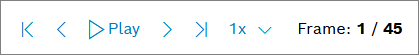
Playback widget
The Playback widget is used to click through the uploaded images and display the images in the other widgets. It is also used as data source.
Proceed as follows
Click the Add Widget button.
Select the Playback widget.
→ The widget configuration page is displayed.Open the Dashboard Settings pane to set how the widget is displayed in the dashboard.
In the Size drop-down list, decide how much space the widget should take in the form of columns, e.g. Full (4 Columns).
Open the Data Sources pane to configure the data source for the widget.
Click the + Add Source button to add a data source.
Select Query Template.
In the Query Template drop-down list, select the query template we created for the Playback widget.
Click the Save Data Source button.
Click the Add button.
→ The Playback widget is added to the dashboard. For more information on this widget, refer to Playback widget.
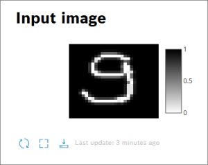
Heatmap widget
The Heatmap widget displays the input image with the digit we uploaded.
Proceed as follows
Click the Add Widget button.
Select the Heatmap widget from the Charts section.
→ The widget configuration page is displayed.Open the Dashboard Settings pane to set how the widget is displayed in the dashboard.
In the Size drop-down list, decide how much space the widget should take in the form of columns, e.g. Third (1 Column).
In the Title field, enter a title for the widget, e.g. Input image.
Open the Data Sources pane to configure the data source for the widget.
Click the + Add Source button to add a data source.
Select Playback: Current Frame.
→ The Playback widget is added as data source.
Open the Chart Settings pane to define layout of the chart.
In the Chart Height field, enter a value for the height of the chart, e.g. 200.
Click the Advanced Settings drop-down menu to further configure the chart widget.
In the Chart Margin Left field, enter a value to define the margin for the left side, e.g. 100.
In the Chart Margin Right field, enter a value to define the margin for the right side, e.g. 200.
In the Chart Margin Top field, enter a value to define the margin for the top, e.g. 30.
In the Chart Margin Bottom field, enter a value to define the margin for the bottom, e.g. 30.
Open the Axis Settings pane to define the axes of your chart.
Open the X-Axis Settings pane to define the x-axis.
Deactivate the X-Axis visible checkbox to hide the x-axis.
Open the Y-Axis Settings pane to define the y-axis.
Deactivate the Y-Axis visible checkbox to hide the y-axis.
Open the Trace: Heatmap Chart pane to select the data paths.
In the X-Axis Data Path drop-down list, select i.[].x. Click the [] and select the Iterate here option. The result looks as follows: i.[i].x.
In the Y-Axis Data Path drop-down list, select i.[].y. Click the [] and select the Iterate here option. The result looks as follows: i.[i].y.
In the Z-Axis Data Path drop-down list, select i.[].v. Click the [] and select the Iterate here option. The result looks as follows: i.[i].v.
Click the color square to select another Start Color for the line or enter a color code e.g. #ffffff.
Click the color square to select another End Color for the line or enter a color code, e.g. #000000.
Activate the Show Color Scale checkbox to show the color scale.
Click the Add button.
→ The Heatmap widget is added to the dashboard. For more information on this widget, refer to Heatmap Chart widget.
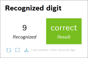
Value widget
The Value widget displays the recognized digit and whether it has been recognized correctly.
Proceed as follows
Click the Add Widget button.
Select the Value widget.
→ The widget configuration page is displayed.Open the Dashboard Settings pane to set how the widget is displayed in the dashboard.
In the Size drop-down list, decide how much space the widget should take in the form of columns, e.g. Third (1 Column).
In the Title field, enter a title for the widget, e.g. Recognized digit.
Open the Data Sources pane to configure the data source for the widget.
Click the + Add Source button to add a data source.
Select Playback: Current Frame.
→ The Playback widget is added as data source.
Open the Value View Settings pane to configure the value.
Click the Add Value button to open the value configuration.
→ The value can be configured.In the Path drop-down list, select r.
In the Format drop-down list, select String.
In the Label field, change the name of the value to, e.g. Recognized.
Activate the Show Only Value checkbox.
Click the Add Value button to add a second value.
In the Path drop-down list, select e.
In the Format drop-down list, select String.
In the Label field, change the name of the value to, e.g. Result.
Deactivate the Show Only Value checkbox to set ranges for the value to be displayed in a traffic light system.
In the regular expression with the red color, enter wrong to display the red color when a digit has been recognized wrong.
Click the Add button.
→ The Value widget is added to the dashboard. For more information on this widget, refer to Value widget.
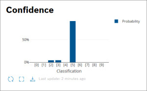
Bar chart
The Bar chart widget displays the confidence of each digit.
Proceed as follows
Click the Add Widget button.
Select the Bar chart widget.
→ The widget configuration page is displayed.Open the Dashboard Settings pane to set how the widget is displayed in the dashboard.
In the Size drop-down list, decide how much space the widget should take in the form of columns, e.g. Third (1 Column).
In the Title field, enter a title for the widget, e.g. Confidence.
Open the Data Sources pane to configure the data source for the widget.
Click the + Add Source button to add a data source.
Select Playback: Current Frame.
→ The Playback widget is added as data source.
Open the Chart Settings pane to define layout of the chart.
In the Chart Height field, enter a value for the height of the chart, e.g. 200.
Click the Advanced Settings drop-down menu to further configure the chart widget.
In the Chart Margin Left field, enter a value to define the margin for the left side, e.g. 80.
In the Chart Margin Right field, enter a value to define the margin for the right side, e.g. 80.
In the Chart Margin Top field, enter a value to define the margin for the top, e.g. 5.
In the Chart Margin Bottom field, enter a value to define the margin for the bottom, e.g. 40.
Open the Axis Settings pane to define the axes of your chart.
Open the X-Axis Settings pane to define the x-axis.
In the X-Axis Title field, enter a title for the x-axis, e.g. Classification.
In the X-Axis Type drop-down list, select Category.
In the X-Axis Tick Prefix field, enter [.
In the X-Axis Tick Suffix field, enter ].
In the X-Axis Tick Format drop-down list, select integer notation.
In the X-Axis Range Mode drop-down list, select Custom Range.
In the Custom Ranges field, enter a minimum and a maximum value, e.g. -1 and 10.
Open the Y-Axis Settings pane to define the y-axis.
In the Y-Axis Type drop-down list, select Linear.
In the Y-Axis Tick Suffix field, enter %.
In the Y-Axis Range Mode drop-down list, select Custom Range.
In the Minimum Value field, enter 0.
In the Maximum Value field, enter 100.
Open the Trace: Bar Chart pane to select the data paths.
In the X-Axis Data Path drop-down list, select p.[].k. Click the [] and select the Iterate here option. The result looks as follows: p.[i].k.
In the Y-Axis Data Path drop-down list, select p.[].v.v. Click the [] and select the Iterate here option. The result looks as follows: p.[i].v.v.
In the Name field, enter a name for the line that will be displayed in the legend, e.g. Probability.
Click the Add button.
→ The Bar chart widget is added to the dashboard. For more information on this widget, refer to Bar Chart widget.
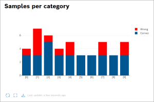
Bar chart
The next Bar chart widget shows how many digits have been either recognized correctly or wrong. This bar chart contains two bar charts that are displayed on top of each other.
Proceed as follows
Click the Add Widget button.
Select the Bar chart widget.
→ The widget configuration page is displayed.Open the Dashboard Settings pane to set how the widget is displayed in the dashboard.
In the Size drop-down list, decide how much space the widget should take in the form of columns, e.g. Half (2 Columns).
In the Title field, enter a title for the widget, e.g. Samples per category.
Open the Data Sources pane to configure the data source for the widget.
Click the + Add Source button to add a data source.
Select Query Template.
In the Query Template drop-down list, select the query template we created for the statistics.
Click the Save Data Source button.
Open the Chart Settings pane to define layout of the chart.
Click the Advanced Settings drop-down menu to further configure the chart widget.
In the Bar Mode drop-down list, select Stack.
Open the Axis Settings pane to define the axes of your chart.
Open the X-Axis Settings pane to define the x-axis.
In the X-Axis Type drop-down list, select Category.
In the X-Axis Tick Prefix field, enter [.
In the X-Axis Tick Suffix field, enter ].
Open the Add Chart Traces pane to select one more bar chart.
Open the first Trace: Bar Chart pane to select the data paths.
In the X-Axis Data Path drop-down list, select [].s.[]._id. Click the second [] and select the Iterate here option. The result looks as follows: [].s.[i]._id.
In the Y-Axis Data Path drop-down list, select [].s.[].r. Click the second [] and select the Iterate here option. The result looks as follows: [].s.[i].r.
In the Name field, enter a name for the line that will be displayed in the legend, e.g. Correct.
Open the second Trace: Bar Chart pane to select the data paths.
In the X-Axis Data Path drop-down list, select [].s.[]._id. Click the second [] and select the Iterate here option. The result looks as follows: [].s.[i]._id.
In the Y-Axis Data Path drop-down list, select [].s.[].w. Click the second [] and select the Iterate here option. The result looks as follows: [].s.[i].w.
In the Name field, enter a name for the line that will be displayed in the legend, e.g. Wrong.
Click the Advanced Settings drop-down menu to configure the bars.
In the Text Position drop-down list, select the position of the text, e.g. Inside.
Click the color square to select another color for the line or enter a color code, e.g. #ff0000.
Click the Add button.
→ The Bar chart widget is added to the dashboard. For more information on this widget, refer to Bar Chart widget.
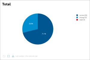
Pie chart
The pie chart widget displays the total percentage of digits recognized correctly or wrong.
Proceed as follows
Click the Add Widget button.
Select the Pie chart widget.
→ The widget configuration page is displayed.Open the Dashboard Settings pane to set how the widget is displayed in the dashboard.
In the Size drop-down list, decide how much space the widget should take in the form of columns, e.g. Half (2 Columns).
In the Title field, enter a title for the widget, e.g. Total.
Open the Data Sources pane to configure the data source for the widget.
Click the + Add Source button to add a data source.
Select Query Template.
In the Query Template drop-down list, select the query template we created for the statistics.
Click the Save Data Source button.
Open the Chart Settings pane to define layout of the chart.
Click the Advanced Settings drop-down menu to further configure the chart widget.
In the Chart Margin Left field, enter a value to define the margin for the left side, e.g. 0.
In the Chart Margin Right field, enter a value to define the margin for the right side, e.g. 0.
In the Chart Margin Top field, enter a value to define the margin for the top, e.g. 60.
In the Chart Margin Bottom field, enter a value to define the margin for the bottom, e.g. 80.
In the Bar Mode drop-down list, select Relative.
Open the second Trace: Pie Chart pane to select the data paths.
In the Labels drop-down list, select [].pie.[].l. Click the second [] and select the Iterate here option. The result looks as follows: [].pie.[i].l.
In the Values drop-down list, select [].pie.[].v. Click the second [] and select the Iterate here option. The result looks as follows: [].pie.[i].v.
Click the Advanced Settings drop-down menu to further configure the pie chart.
In the Text Content drop-down list, select Relative Values (%).
In the Text Position drop-down list, select Inside.
Click the Add button.
→ The Pie chart widget is added to the dashboard. For more information on this widget, refer to Pie Chart widget.